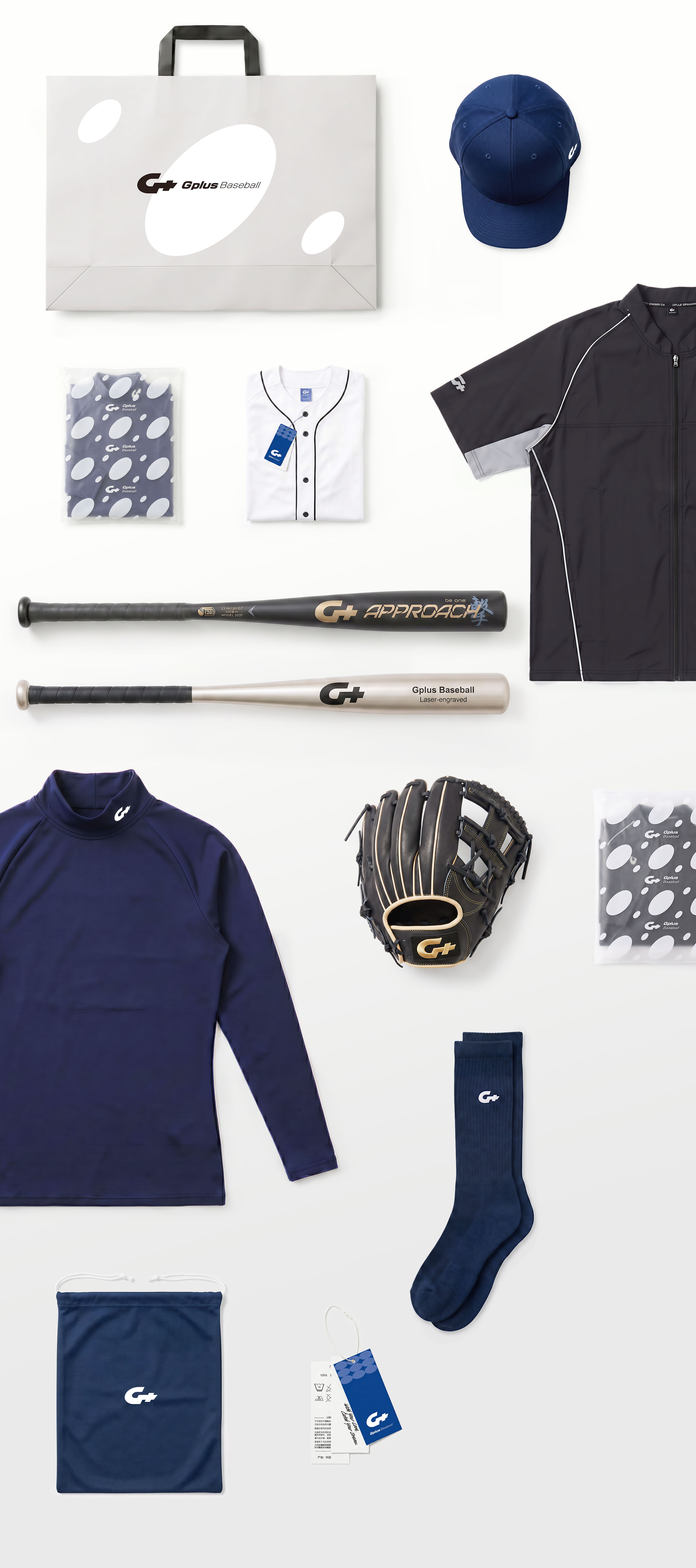
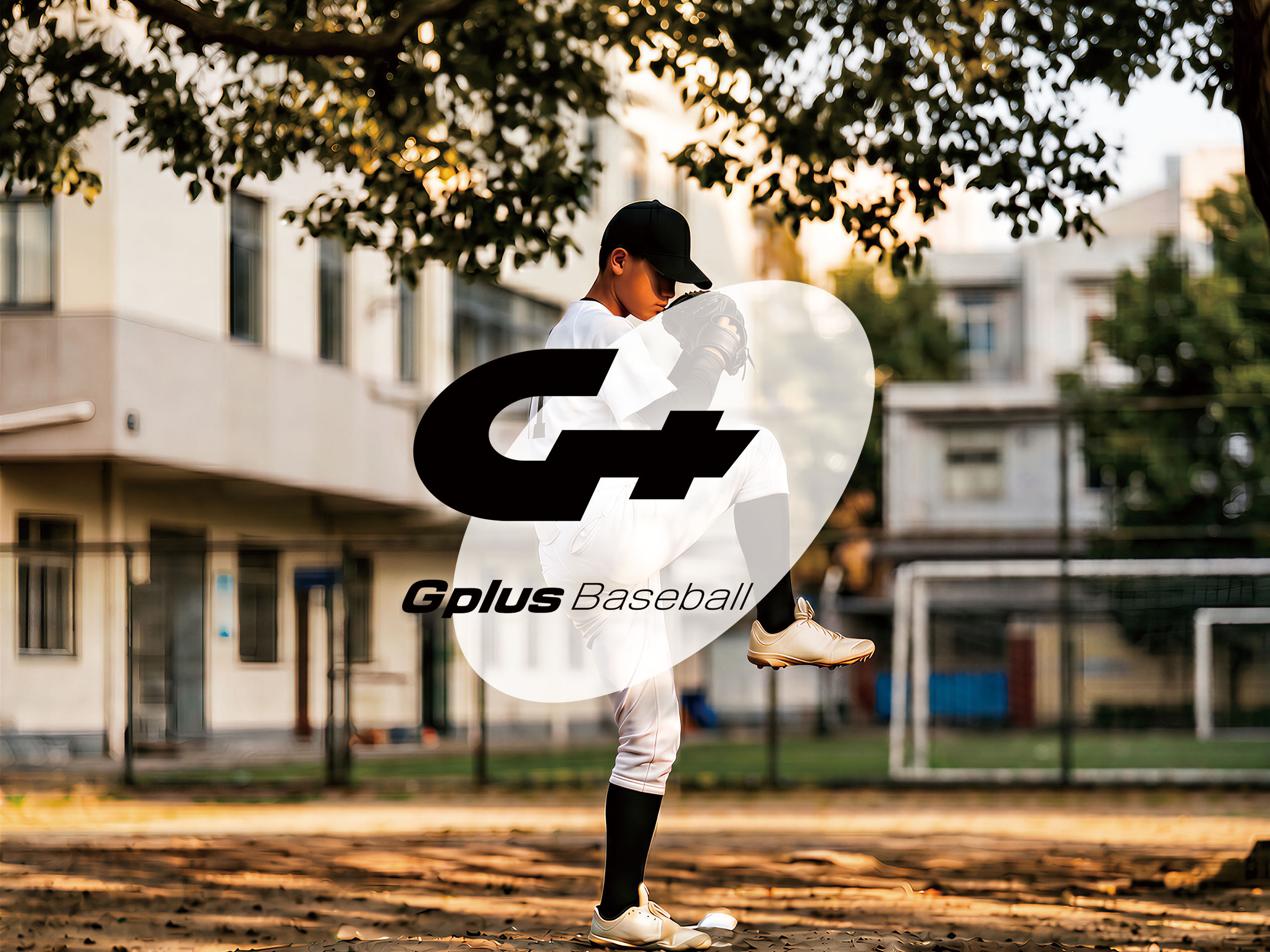
As a comprehensive professional baseball equipment brand, Gplus focuses on balancing functional attributes with on-field experiences. By capturing sensory and auditory feedback—the crisp crack of a bat, the firm grip of a leather glove, and the breathability of apparel under intensity—our visual system translates these athletic dynamics into concrete perceptions of premium quality, establishing a highly recognizable brand identity.
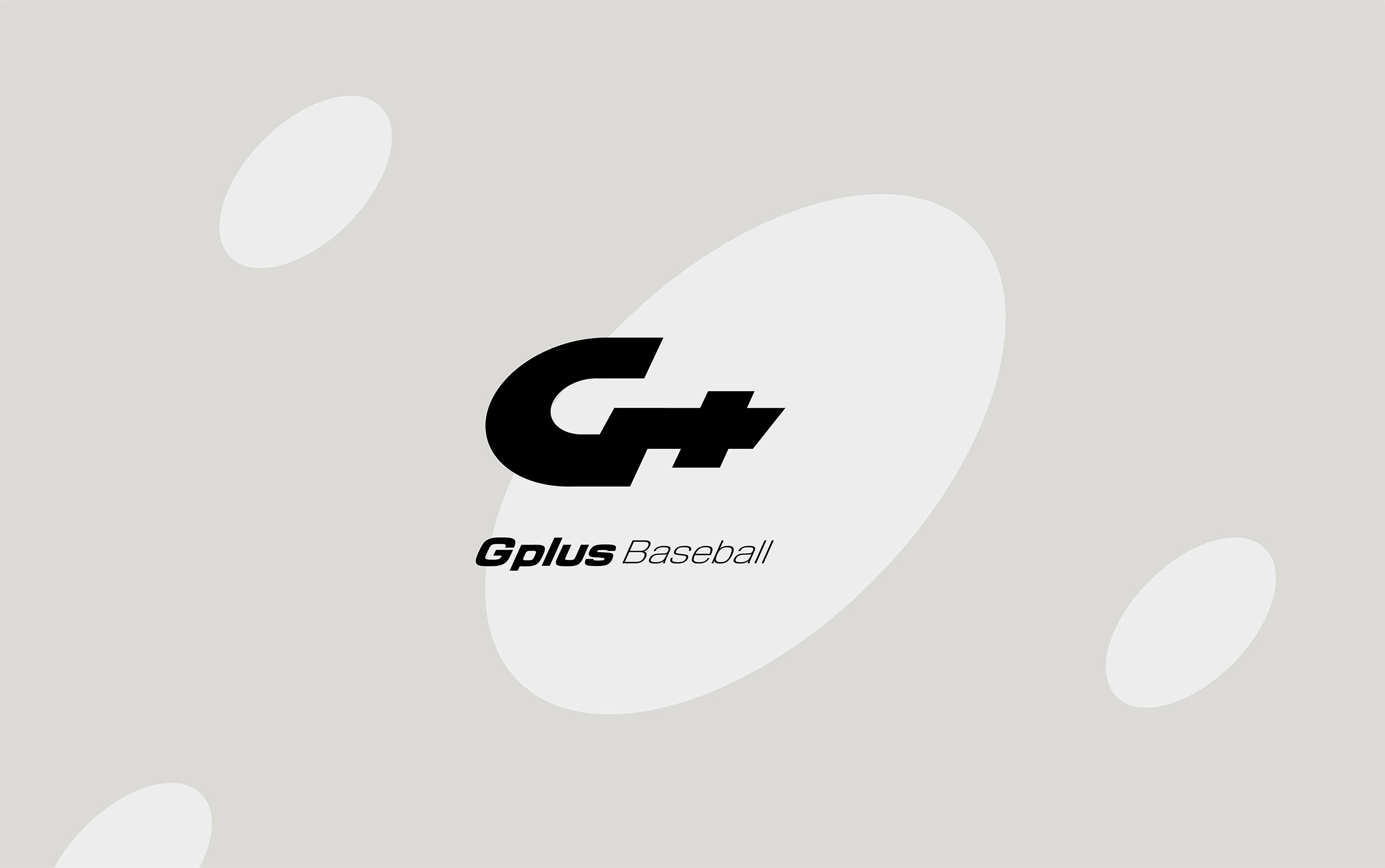
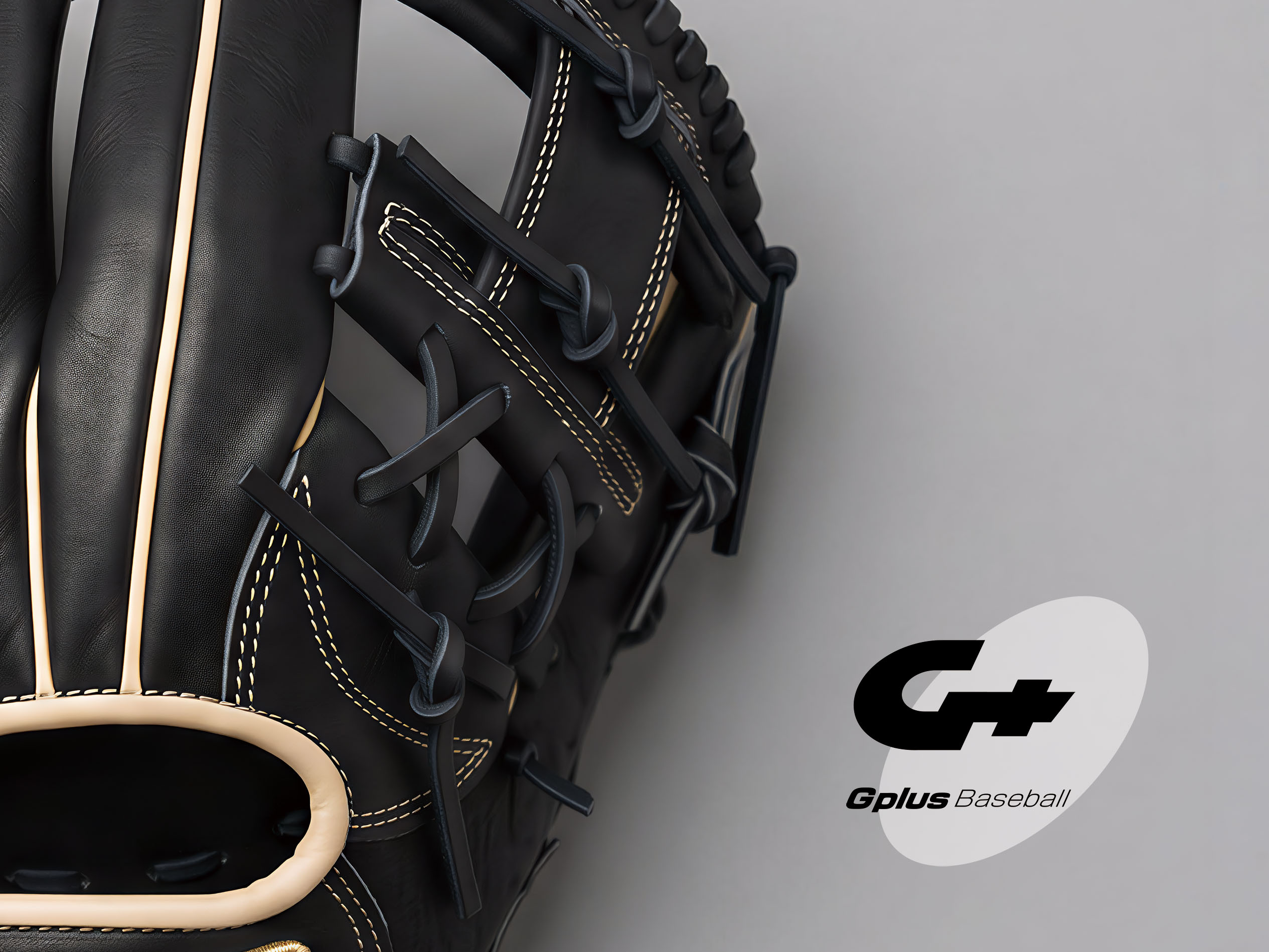
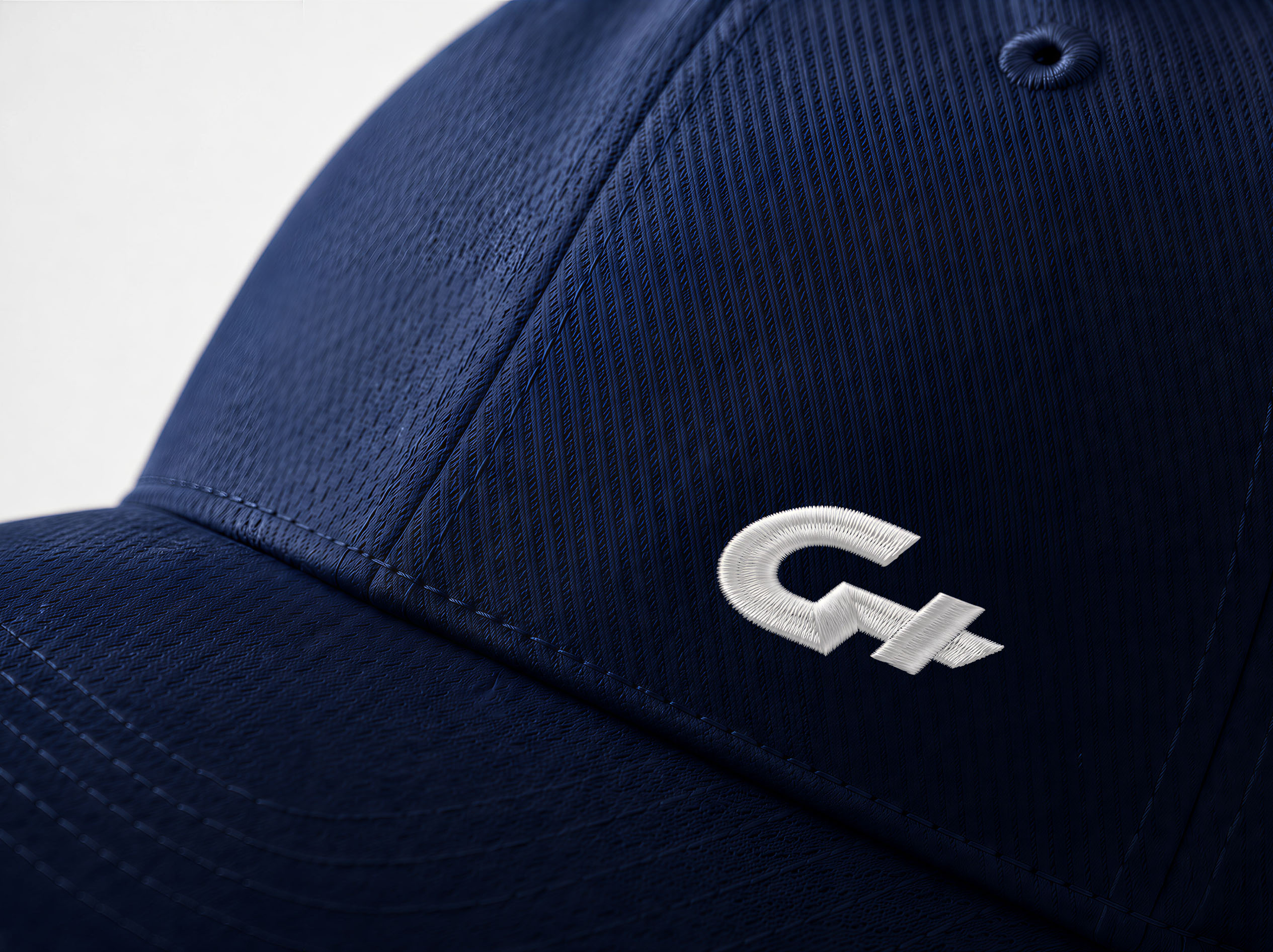
The initial phase of the redesign involved deconstructing the original visual markers. The legacy "G+" graphic featured rigid, square lines, rendering it somewhat inert. Retaining the core logic of the integrated "G+," we reshaped the silhouette into a velocity-oriented oblique ellipse. In this execution, the circular letter "G" encapsulates the aerodynamic resistance of a high-speed rotating baseball, while the sharp horizontal cut of the "+" symbol references the precise finger flick at the exact moment of pitch release. This refinement elevates a static icon into a dynamic emblem charged with explosive power.
The framework establishes the rigor and prestige required of professional gear through a disciplined, rational grid layout. Concurrently, it utilizes high-tension angles and facets to unlock a vibrant, energetic persona reminiscent of classic sports manga. This core aesthetic lives at the intersection of a disciplined structural backbone and raw athletic passion.
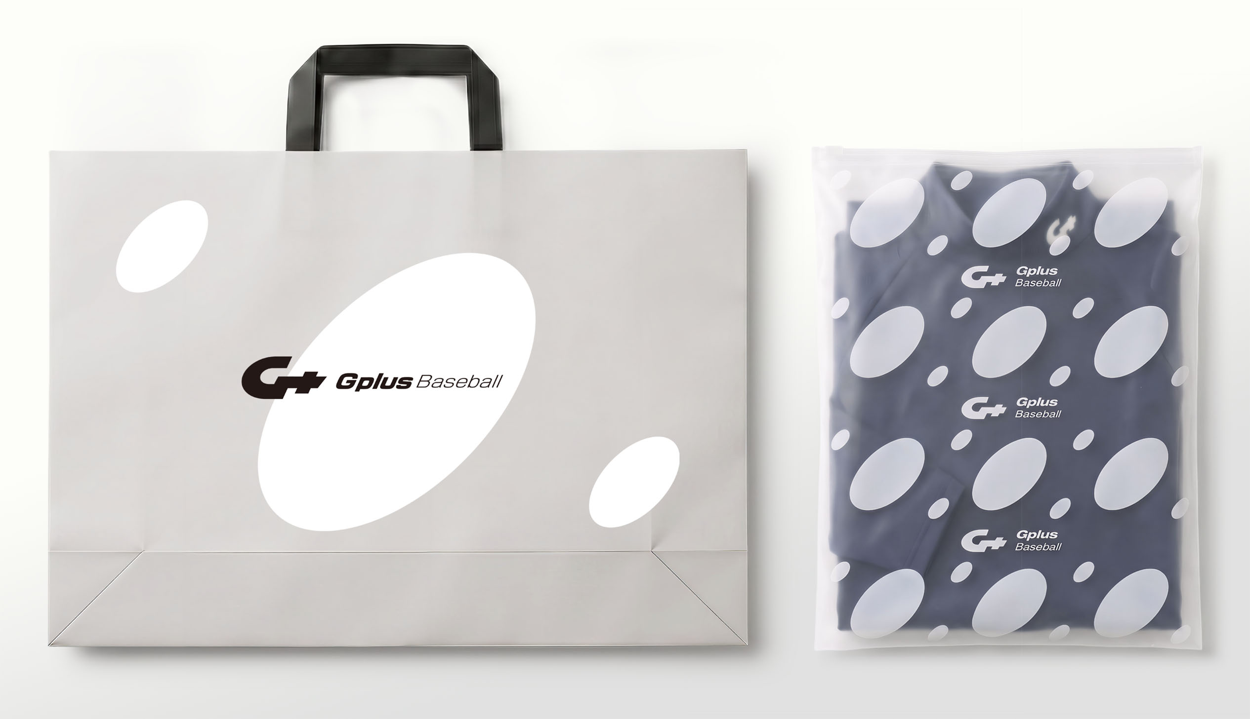
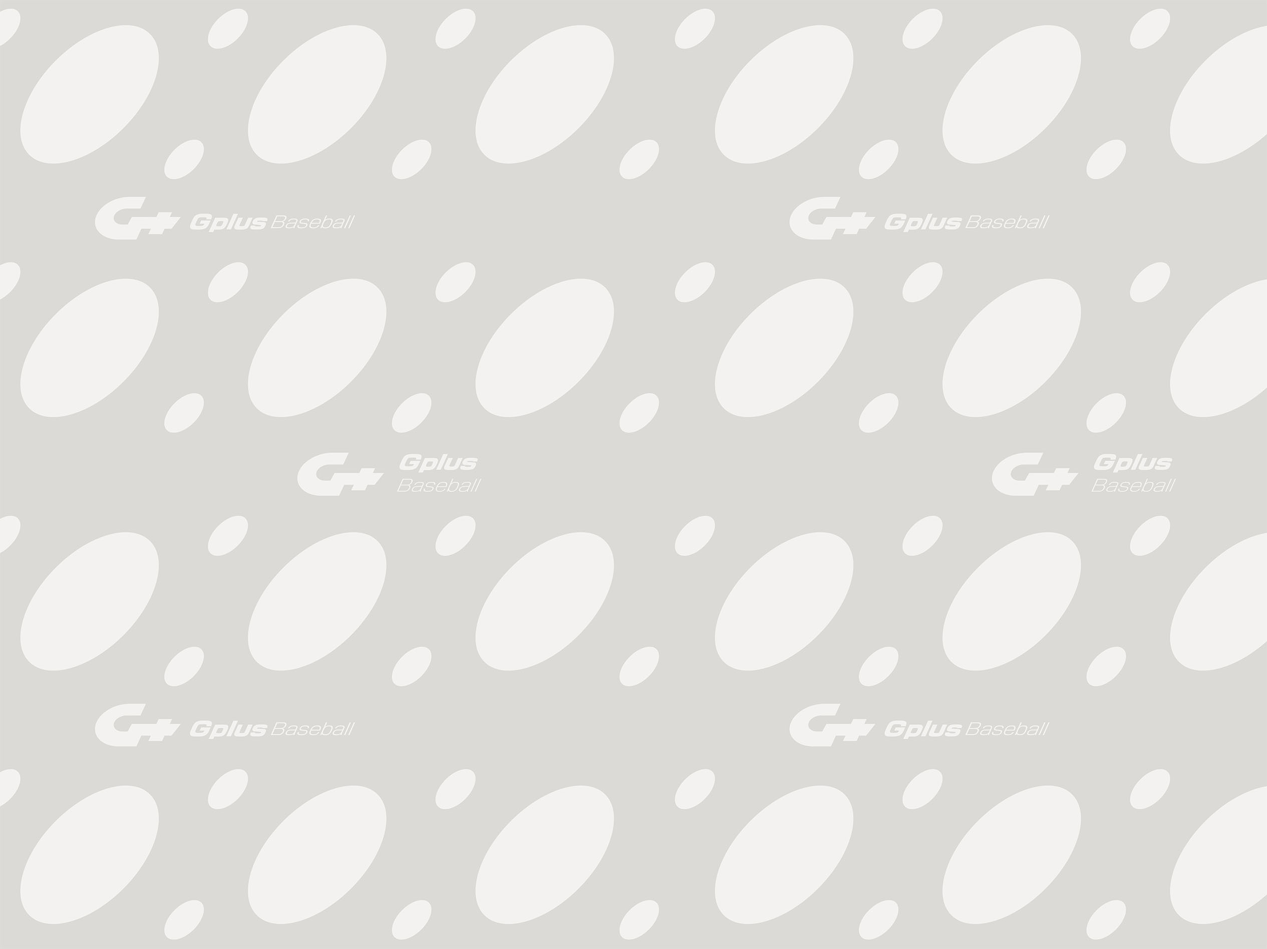
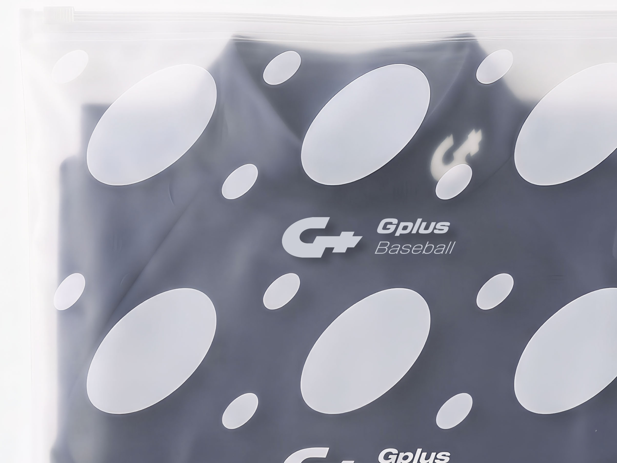
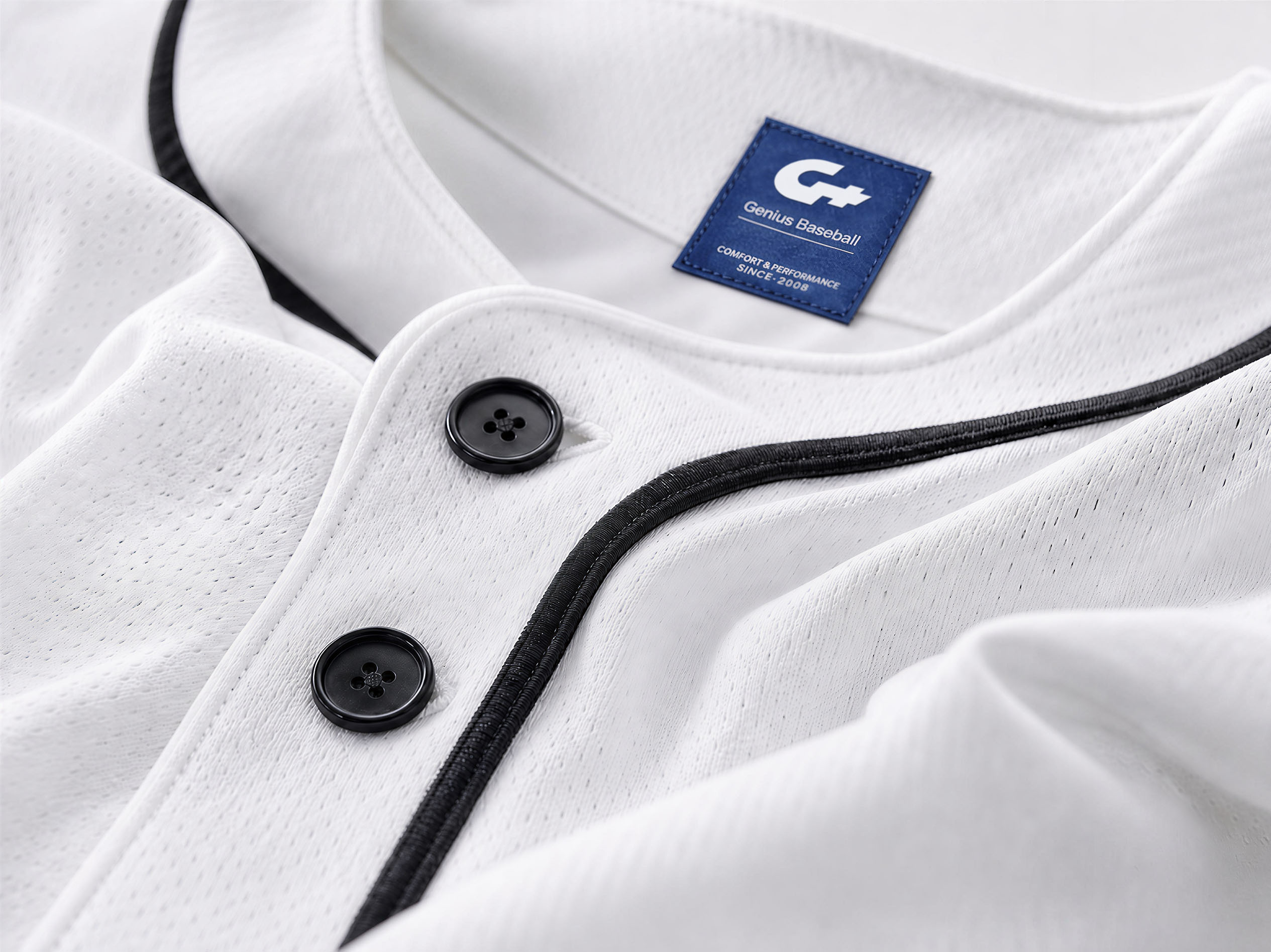
This visual system extends seamlessly across high-performance jersey labels, glove embroidery, and uniform product packaging. Navigating diverse collateral applications, we deliberately balanced "expressive graphics" with "restrained layouts." Clean, sharp typography disciplines the wildness of the underlying shapes, building an uncompromised sense of professional order. This design is not merely a commercial signifier; it is a systematic visual architecture built to restore the purest professional experience and joy of the sport for baseball enthusiasts.